Optimizing your email for mobile devices is not something that should be ignored especially if you want more people to engage with your email marketing campaigns. Statistics show that about 55% of emails are now opened on a mobile device and 80% of recipients delete emails not optimized for mobile.” The advancement of technology has made it possible for people to access their email from the comfort of their mobile devices.
In 2022, being able to design emails for mobile consumption is very important if you want people to engage more with your emails. Your emails should be designed in a way that is suitable for mobile viewers to achieve success for your marketing campaign.
Therefore, the email you are sending to your customers should be mobile optimized because many users like to check their email on mobile devices. Many customers view your email with their phones and if your email is not optimized for their device, it can affect your business.
A responsive email design is more important in 2022 than ever and it will become a new standard. Your email must meet the mobile standard first then other devices can follow.
That’s why we have compiled some important tips in this blog post that will help you optimize your email for mobile consumption.
Mobile Email Statistics
- According to Statista, 49% of all web traffic was from mobile devices in 2019.
- Statistics reviewed that there are about 3.9 billion unique mobile internet users worldwide, which is expected to reach will 4.4 billion users by 2023.
- Another statistic estimated mobile email users to be 2.2 billion at the end of 2018.
- More than 50% of email campaigns are viewed on mobile.
- The iPhone is the most used device to open emails.
How To Optimize Your Email For Mobile Devices
1. Choose a Responsive Design

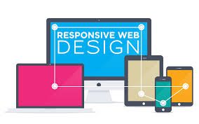
Responsive design is a very important feature when it comes to optimizing content to suit mobile viewers. Like how your website is responsive to mobile devices, your email should also have a responsive design. Responsive design is a feature that allows your content to fill the screen of any device (Android, iPhone, tablets, and desktop). When you apply responsive design to your email, it automatically fills the screen of any mobile device (phones, android and tablets) and looks good on any mobile devices your subscribers use to read your email. This means your subscribers can view your email without having to scroll left and right, or zoom in and zoom out to see the whole content.
Most email service providers offer a responsive design, however, you can always create your own. This gives you more flexibility with your designs that allows you to use multiple columns and optimize for mobile users, while also maintaining the desktop experience because a lot of people are still reading emails from their desktops. Most companies like Google make use of scalable design for their emails. Scalable emails are emails with a single-column design that uses large text. This type of email looks the same regardless of the devices they are viewed on.
No matter how great your email marketing campaign is or how valuable your content is, starting with a mobile-friendly and responsive template is the first step in optimizing your email for mobile audiences.
2. Take note of the preheader text
The preheader refers to the short summary text that is found below the subject line when an email is viewed in the inbox.
Many people often ignore and overlook the pre-header text, but it can be very useful when it comes to mobile-friendly emails. It serves as a support to the subject line and provides extra characters that you can use to incentivize your recipients to click.
Like your email subject line, it’s important to keep your pre-header text short, informative and easy to consume. You can also split test your pre-header text and have it tailored according to your target audience, their preferences, and the email clients and devices they’re using.
Also, the pre-header length might vary based on the email client and by device, so try different lengths and see what works best based on the metrics you have collated on where your subscribers are opening your emails.
3. Rethink your subject line

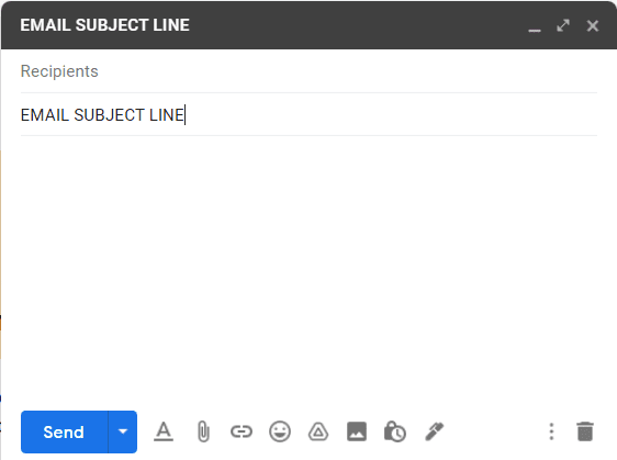
According to Kevin George, the subject line is the driving factor for email opens. Therefore, it is very important to optimize your email subject lines for mobile devices. Statistics show that the subject line of a desktop displays about 60 characters, while mobile devices show only 25-30 characters. It is very important to keep your subject line short and attention-grabbing if you want your subscribers to engage with it.
Research which email client is most popular with your audience along with your past subject line performance to determine the best subject line character length.
Also, make sure you understand what percentage of your subscribers will open your email on a mobile phone, desktop and tablet, so you determine the best subject line length.
The subject line is the preview of your mail message. Be sure to make a subject line that grabs the recipient’s attention and give them a fascinating reason to open your email.
4. Keep your email short
Remember that a mobile email reader is likely busy and multitasking on the go, so they will only skim through your email for relevant details. If they are having to continuously scroll through the message to get to your point, the chances they will stop reading your email are much greater. Make sure you have all of your important information clearly stated and use bullets, which are great to break up content.
Email can be deleted more quickly on a mobile device, so it’s important to make sure your subject line and main copy are enticing, engaging and straight to the point.
Your email must contain quality content with relevant information, a compelling offer and a clear call-to-action
Don’t stuff a lot of text in the email. Be concise, use easy-to-read fonts and make it easy on the eyes.
5. Use Buttons
While a CTA in a text-based link might work, there are better options that may work better for mobile users. In mobile-friendly marketing emails, it’s best to bring CTAs as far up within the copy as possible to limit the amount of copy used. Using buttons for your CTAs is an even better idea because hyperlinks don’t make the most of an email’s mobile-responsive design. Buttons are much easier for people to click on when using a mobile device with a touch screen. Make sure you add an eye-catching and easy-to-click button that mobile users won’t be able to miss.
Make sure you leave a sufficient amount of white space around the button to encourage mobile user experience. Limit the number of words used in your CTA button and use action words that serve as an encouragement for people to click.
In addition, your call to action can be placed at the top of your email to make it more mobile-friendly. Ensure that your CTA buttons are 44 x 44 pixels which support mobile devices to ensure maximum clicks.
6. Know your audience
The first step in optimizing your email for mobile devices is to research and know how your audience is reading your email. According to research, the majority of email content in the U.S. is being viewed via Gmail (42.1%) and on iPhones. Knowing the device and the email service provider your recipients use to view your email helps inform you on how to best develop your emails.
Knowing what email platform and devices your audience use in viewing your email, you can determine the number of words that should go into your subject line, the pre-header text and the overall layout of the email.
7. Use Your Image Carefully.
Adding images to your email is a good way to grab the reader’s attention, but too much of it can be detrimental for mobile users. Incorporating too many images or graphics that overshadow your message might slow down the speed of the email and this might be a turnoff to your readers. Use a minimum of one image that clearly states what you are trying to pass across in your email and make it mobile-friendly before sending it.
When adding your images, make sure you add a description to each image file. So when the image doesn’t show or preview, the description tells the readers what the image is about.
Furthermore, aim to strike a balance between the text and images used in the email to avoid your email going into the spam folder. Go with a 60 to 40 or 50/50 with your text and images. Don’t let one more than the other.
Also, when it comes to using images, the smaller the file size the better because they might take forever to load on mobile devices. Mobile devices come with a much slower download speed than Desktop devices, so keeping the image file sizes small can really help with the downloading speed of your email. Make use of JPG or JPEG and reduce the file with an online image compressor to reduce the size.
Choosing your image carefully makes your subscribers less frustrated and less likely to delete your email before it loads.
Note that some email service providers might block images by default. Incorporate alt tags to help inform your subscribers about what’s being viewed. You can also style the ALT text to make it look attractive when the images don’t load.
8. Font size
Font size matters when writing an email. Make sure you choose a clear and readable font. Your text should be readable on any device. Use large fonts and avoid using fonts that are cursive and difficult to read. Also research on fonts that are compatible with various mobile devices so that your mobile audience will be able to read and understand the message you are trying to pass across in your email. Additionally, be aware of font changes across different devices.
Aim to strike a balance between the font size of the title and the text. For example, you can choose 22-25pt for the title and 14-17pt for the text. For the font size, you can use times new roman, calibre, Arial, Tahoma or courier new because they are professional and readable fonts.
9. Test and Proofread Your Email
When you are done with your email, make sure you proofread for any mistakes and grammatical errors. Also, check that the structure of the email ranging from the subject line to the call to action is well stated. Make sure that your links work properly, images load quickly and your subject line and pre-header are well optimized for mobile devices.
After that, test your email on all types of mobile devices like iPhones, androids, tablets, and others. Each device might render or display emails differently just like how a web browser renders web pages differently. Similarly, email clients like Gmail, Yahoo, Outlook, Apple Mail, also display email differently.
The more you test your emails, the more you will figure out the best email structure that will work well for your audience.
Conclusion
As billions of people are gaining more access to smartphones and mobile devices that are connected to the internet every day. There is a need for marketers and online business owners to also step up their digital marketing strategy to attract more customers and ultimately generate sales.
Email marketing is no different, as many people are viewing emails from their mobile devices, there is a need for marketers to incorporate a mobile strategy into their email marketing to effectively target mobile users.
The aim of any digital marketer is to make a profit, generate traffic, and increase brand awareness. The best way to leverage email marketing is to make sure your email marketing campaigns are well optimized for every device. Not just mobile devices, desktop as well. Research on the devices that your customers use most when they are viewing your emails, what email platforms they use and the time they engage most with your email. Knowing this will give you an insight into the email marketing behaviour of your customers and this help you target them better.


